


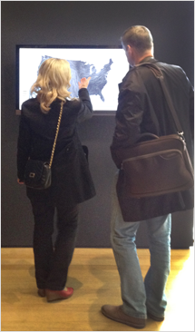
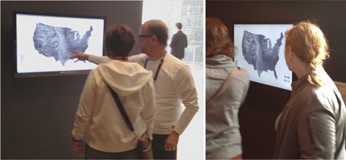
Wind Map
at MoMA.
Prints are available
Large prints, made in collaboration with Rebecca Malamud, are available from Point.B Studio.
Read about the wind map
Winds of Change, The Economist
The New World of Net Art, ARTnews
Blown Away, The Economist
"The Week In Ideas - On With The Wind", The Wall Street Journal
Google's Data Viz Geniuses Chart The Invisible Beauty Of Wind, Fast Company Design
See our mistakes
This Eyeo 2012 talk describes the process that led to the wind map, including
some funny false starts.

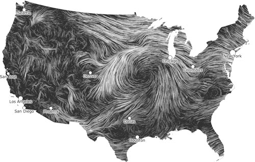
An invisible, ancient source of energy surrounds us—energy that powered the first explorations of the world, and that may be a key to the future. The wind map shows the delicate tracery of wind flowing over the US.
The map was created in the cold winter months when wind was much on our minds.
It conveys the movement of the air in the most basic way: with visual motion. As an artwork that reflects the real-world, its emotional meaning changes from day to day. On calm days it can be a soothing meditation on the environment; during hurricanes it can become ominous and frightening.
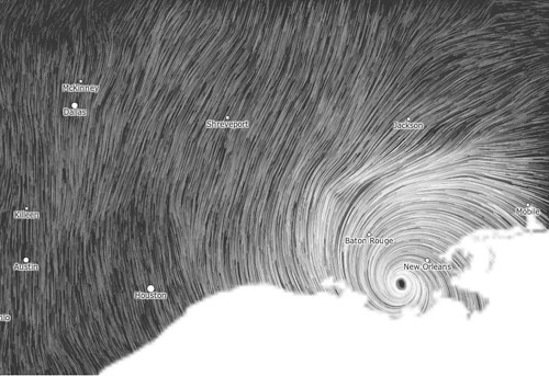
Images from Hurricane Isaac (September 2012):

Although we made the wind map as an artistic exploration, we've been surprised by the kinds of things people use it for: bird watchers have tracked migration patterns; bicyclists have planned their trips; and we've even seen conspiracy theorists use it to track mysterious chemicals in the air.
Even on a day of mild weather, patterns can be dramatic. There's much more
to the wind than a west to east flow.

Wind Map at MoMA

About the data: Surface wind data comes from the National Digital Forecast Database. These are near-term forecasts, revised once per hour.
About the technique: The general technique of using comet-like trails to show motion goes back to Edmund Halley in 1686 (see Fowler & Ware). Many scientists (Fowler & Ware, Jones & Saito, van Wijk, etc.) have described variations during the past few decades. Our map is designed to provide a dense, easily readable field and to highlight areas of high wind speed. It's implemented entirely in HTML and JavaScript.